DigWP Site Redesign
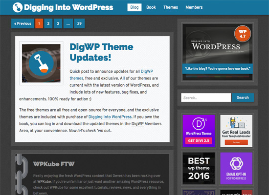
After rocking our site’s previous design for nearly four years, it was time for a refresh. Actually complete overhaul is more like it, a top-to-bottom restructuring and streamlining of DigWP.com.
Going into the redesign, the goal was twofold: 1) visually keep things as focused and clean as possible, and 2) under the hood, unify everything and simplify down to an absolute minimum. As with any eight-year-old website with over 400 posts and integrated e-commerce system, there was an enormous amount of work required to get the job done.
File cleanup
Under the hood, the site had accumulated all sorts of one-off directories, project assets, and other loose files that really needed to be cleaned up, removed, or integrated in a more uniform fashion with the rest of the site. I mean, we’re talking about an eight-year-old multi-author blog and ecommerce site that had already been through three (or four?) complete redesigns. So there was a lot of disparity and general chaos that needed reigned in and dealt with.
For example, the Theme Clubhouse began as a whole separate subdomain WP-install, and then eventually moved to its own subdirectory, and now after streamlining everything, is an actual WP Custom Page template. So the loose /clubhouse/ directory has been removed (simplifying the root directory) and the clubhouse design is now identical to other DigWP pages.
Likewise with other things like tutorial demos, code downloads, and so forth. There were a lot of things just sort of “floating around” that needed to be brought in, cleaned up, and integrated with the core site. So now instead of a site that feels piecemealed together over the course of eight years, under the hood everything is part of a complete, unified website.
Database cleanup
Behind the scenes, in addition to the files is the site’s database. Here is a list of things that were cleaned up:
- All 404 and redirect links were fixed or removed
- All weird characters were replaced or removed
- Post comments were pruned for quality, relevance, etc.
- Unused database tables were removed (greatly reducing DB size)
- Old/unused post meta data was removed
- Removed expired transients, post revisions, and other cruft
After this exercise the database size went from over 50MB to around 35MB, which is a huge improvement. Smaller databases are easier to backup, easier to manage, and easier to restore. So this was a big part of the site overhaul.
Post content
One thing that really bothered me about the previous site designs is that there was no consistency in terms of custom-post styles. Each of the first three themes had their own set of CSS styles, for things like captions, popout boxes, images, and so forth. Then we also used an art-direction plugin for awhile, so some of the posts had that going on as well.
Basically the intra-post styles were a mess, but now have been cleaned up and simplified to a tight, uniform set of CSS classes that can be used anywhere in the site. For example, if I want to add a caption, I can wrap the text with .post-caption class and done. Likewise for .post-popout, post-update, and so forth. Seems like such a simple thing but until now the site was miles away from it.
Some examples of post classes that I use frequently:
Also while going through post content, a lot of other changes were made, for example:
- Updated code/techniques where necessary
- Improved content semantics and structure
- Added new links to related information
- Added new update and popout information
A LOT of time was spent going through the post content. Probably too much, but the result is a much more complete and unified set of blog posts.
Plugin cleanup
Another thing that kept bothering me about the site were the myriad PHP Notices and Warnings (and occasional Errors) that kept popping up. So a redesign is the perfect time to drill down, investigate, and resolve as many of those nuisances as possible.
In some cases, this meant tweaking some essential theme functions. In other cases, it meant finding replacements for weak plugins, and in a couple of cases, it meant just dropping the “noticy” plugins altogether.
For example, the Subscribe to Comments plugin we were using had been a part of the site for many years. And for the past who knows how many years has been triggering a PHP Warning (or Notice, I can’t remember) about some object method or whatever. Finally asked myself whether or not the plugin was even necessary anymore.. turns out that it’s not, so I replaced the “subscribe-to” checkbox with a simple link to the comments feed for the post. PHP error log got a lot cleaner and users can still stay current with comments.
End result: the site is down to only 12 plugins, and zero recurring PHP errors/warnings/notices. Incidentally, four of the 12 plugins are for disabling unused core stuff like Embeds, Emojis, Responsive Images, and the whole REST API thing. Moving on..
Comments..
Speaking of comments.. these days social media has pretty much obliviated any need for an in-house comments facility (IMDb anyone?). So I probably could have saved myself several hours of work fiddling with the comments section by simply wiping them out and just closing comments on everything.
The site, however, has a LOT of great feedback and comments, so I wanted to keep those available as a reference to any souls out there who may benefit from the information. Probably next design though, will be whacking the comments, depending on how things go in the meantime.
Theme design
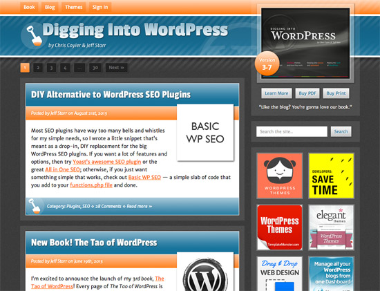
Last but not least, the DigWP theme was completely refactored and redesigned. As you can see by comparing with previous designs, the new theme stays true to the thematic trajectory and overall “look and feel” of the site. So familiar visitors will not be shell-shocked with something completely different, and new visitors will enjoy the many features of the new design.
Keywords for the new design: uniform, bold, clear, tight, clean, focused.
As mentioned, the main thing that I wanted to do with the new redesign was streamline and integrate everything into a complete, solid site. For the actual design, I was going for consistency across pages with a strong focus on content. The previous blue/orange design was close to what I wanted, but some aspects just needed a little more tweaking.
To make a long post a little shorter, here are some highlights of the new theme:
- Very clean and minimal theme template structure
- Minimal redundancy, reuses code, images, assets, etc.
- Limited palette of styles (colors, fonts, shadows,
@media, etc.) - Eliminated a lot of extraneous bells and whistles
- Removed the polls functionality
- One stylesheet only (plus some various inline styles)
- Minimal amount of JavaScript/jQuery
- Improved navigation around site
- Added popular posts and related posts
- Revamped Members Area
- Kept the Aside/Link posts :)
- Line highlights for code snippets
- Minimal social-media stuff
- Simplified header and footer areas
- Fully responsive and cross-browser compatible
- Only uses about 30 lines of
@mediastyles - Dropped Google Analytics
For the theme’s custom fonts I went with Raleway for the headings, and Overpass for most everything else. I think these fonts are great and well-suited for the site’s content. The only real gripe might be that the Overpass vertical bars seem just waaay too long: | (wtf?)
Also completely redesigned the Book Area, so it’s more like an actual sales page and not just a bunch of information all thrown together. LOL.
To-do list
Overall, I feel that I accomplished everything that I set out to do.. and then some. Even so, there remain a few things that I want to make note of so I can maybe continue working on them for the next design:
- Continue replacing images with responsive (higher rez) versions
- Streamline/consolidate images (uploads, images, and theme directories)
- Figure out why wptexturize is not auto-replacing straight quotes with smart/fancy quotes
- Remove FeedBurner
As with most things, a site design (and everything that goes with it) is a work in progress. You can pour yourself into it, but at the end of the day, there’s always something else to work on. So at some point, you just have to call it “done” and move on to the next big adventure.
That’s a wrap
So that’s basically how I spent the last four-ish weeks of my life. Time will tell if it was worth it. Of course, I love this line of work so I could literally talk/type about this stuff for hours and hours, but I’ll leave it here for now. Hopefully this post gives you a better idea of the ins and outs behind the scenes of our latest redesign. Definitely not as easy as going out and buying a new theme and calling it a day. Waaay more complex than that.
If I had to boil it all down into a single goal for the site: I wanted something that inspired me to write and post more content. This new design definitely does that. So take a moment to look around and check it out. And if you notice anything weird or whatever about the design, please let me know in the comments. As always thanks for your generous attention :)
8 responses
-
A nice improvement – direct, clean and simple. Quick question though, something that’s always bothered me a bit (since it’s so common), why make the single-post-template title a link to itself (as is the case here too)?
-
We knew, of course, a huge change had occurred several days ago but it’s great to hear (and be impressed by) the extent to which you went.
A topic for another post, perhaps, is a “side-bar” to to explain which of the 12 plugins you left in and why. I’m particularly interested in the four you describe as removing “unused core stuff”. I’m not positive that the “stuff” I’d like to axe is the same things you did; but, they sound like they might be and I’d really like to know how you saw the issues and solved them.
Oh… to my way of thinking, a thorough cleanup of an “opinion leader” site such as DIGWP is ALWAYS worth it, if only to espouse that you really believe the “best practices” that you write about. I’m surprised with the length and volume in the site it only took you four[ish] weeks.
Thanks for keeping this up – when it seems that many other sites that I frequent for advice seem to be packing it in.
-
Great work once again. I like clean and simple but yet very professional designs.
-
The new design is awesome, I like the short width, simplicity where the focus is on the content and not on some fancy design elements. My only suggestion would be to increase the content font size for +1px and add a slightly bigger line height.
