Site Redesign

Well sort of.. more like a design “refresh” really. DigWP.com launched in May 2009 with its first (brown) design. Then later that year the site was redesigned for the launch of the book. The second (blue/grey) design was well-suited for the site and a natural progression from the first design, and the new design continues along the same path.
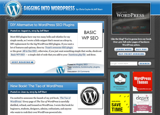
Here is a screenshot of the first design, fixed-width with 3D effects and big focus on blog content:
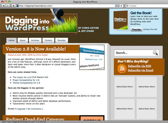 DigWP.com v1, May 2009
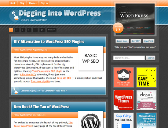
Then later that year, the fixed-width blue/grey design brought it all together:
The new design is essentially the same basic layout, only responsive and with a bit of orange to attenuate a toned-down blue/grey palette:
As you can see, much of the previous design remains the same, with most of the work going into making things lighter, more streamlined, and responsive. Other theme changes include:
- Image slider on the main book page
- Reorganized/streamlined the Members Area
- More prominent next/previous navigation for single posts
- Added paged navigation for home page and archives
- Dual search: direct WP search + alternate Google search
Beyond appearance, a lot of time was spent updating content, demos, examples, and so forth. Behind the scenes, we’re moving away from the E-junkie service and using a plugin for the purchases/transactions. Before the redesign we were using around 25 plugins, now there are 13, so lots of streamlining happening behind the scenes. It’s always good to get in there and clean things up.
The goal of the redesign is a better experience for visitors, so if anything isn’t working or could be improved usability/design-wise, suggestions are welcome!
Update!
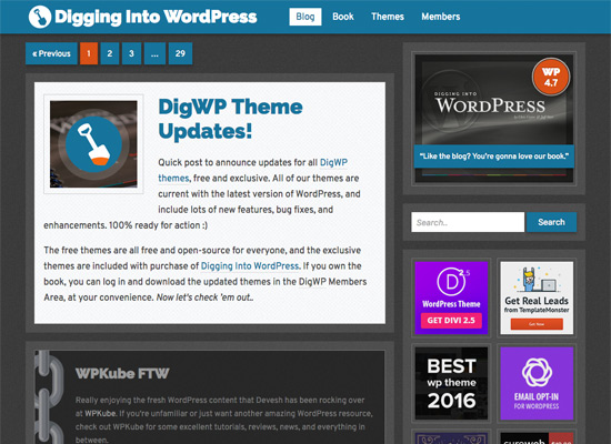
After rockin’ the previous blue/orange design for nearly four years, the site received a major overhaul and complete redesign in February, 2017. Here is a screenshot for future reference:
I feel that the new design stays true to the “look and feel” that we’ve established for DigWP.com. As always, the main focus of the site is on the book and blog content. To help in that regard, the color scheme was simplified and the graphics and visual effects were dialed back a few notches. This helps to keep the eye on the content, not the design.
You can learn more about the new design in the announcement post.
