Free Theme: WP Typo
A big thanks to everyone for being supportive of the website launch for Digging Into WordPress. As a way of saying thank you, and to celebrate our launch, I’d like to present to you a brand new free WordPress theme for you to download. It’s called WP Typo. You can view the demo here and download the theme here. It was designed by myself, then coded through WP Coder (as part of this review), and a little additional coding again my myself.
Here is the scoop
Here’s the highlights for WP Typo:
- It is 100% typographic; there are no images used at all.
- It includes the PSD in case you want to make modifications and want to feel it out graphically first.
- You can do whatever the heck you want with it. No attribution required.
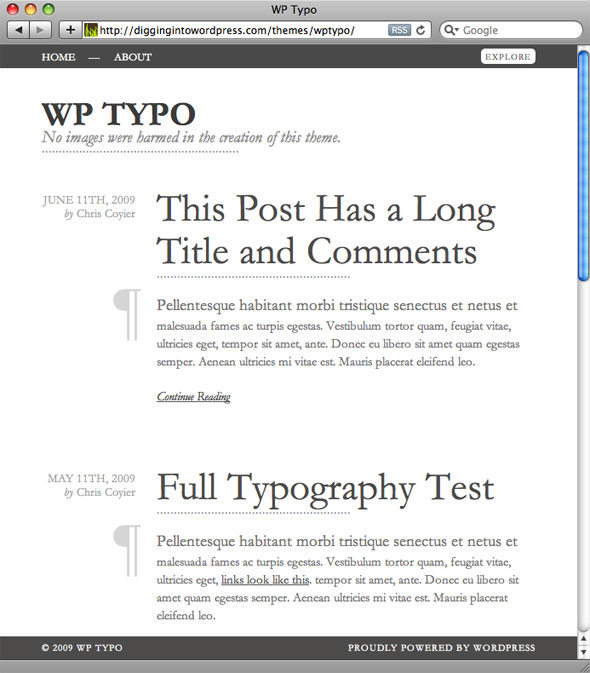
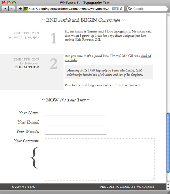
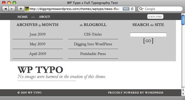
Here are some screenshots of the theme in action..
Homepage
Comments
Cool Slide Down Explore Area
73 responses
-
Garamond! Lovely. Serifs seem to be making a comeback.
-
Looks very nice :)
@Jessi, they never got lost :P -
Nice one, Chris, like the subtle touches, love the absence of colour, images etc. It seems that those features are often used to hide lack of design skills these days … Thanks !
-
Thanks Chris, I love it =)
-
Nice, particularly like the comments form. Good job.
-
hey! the theme is great and wp coder did an awesome job on it :)
-
Love it, need to use it!
-
A really nice simple design, you can’t beat a typographic design – great work. I must say, using that review for the good of the community (and not your own personal gain) shows a lot of integrity.
Thanks!
-
Nice theme. If you released this theme sooner, maybe I use it for my blog. Take a look at my blog, it has a typo theme too. (it’s in Blogger, but no matter)
-
I don’t have Garamond on this machine, only Adobe Garamond Pro, and I must say it looks rather terrible. Maybe it’s my ClearType settings but I can hardly read this typeface. :O
Georgia ftw!
-
Chris, looks fantastic, but won’t it be completely ruined without the Garamond font which isn’t a standard font?
-
I’ve also created a cufon patch to solve this problem – you can find it here1.
So at least
h1,h2&h3titles and classes.description,.continue,.paraand.bylineare now replaced by Cufonized version of jGaramond (it is not definitely nicest one, but it is free).More info about how to generate own Cufon font and incorporate it to this theme you can find inside .zip file
1 Editor’s note: 404 link removed.
-
-
The theme looks great Chris, well done!
-
How beautiful and elegant. A real pleasure to the eye.
Liked your comments dummy text as well, LOL
-
Simple, elegant, brilliant. Only thing i don’t like is how garamond renders on windows browsers at some sizes, but that should be tweakable :)
-
very beautiful
-
Beautiful! Visually stunning. I’m definitely going to take a look at all its internals.
-
this is great. very simple wordpress themese work great, I’m not sure about using gramond, though, I might have to tweak it a bit.
-
Horribly nice. Just a thought – how about adding Palatino and “Palatino Linotype” to the font stack? Also, why aren’t you using the official WordPress theme directory?
-
If he poops you all will say “wow! fantastic”. Its the fallacy of being famous. I don’t see anything beautiful in this theme. Only the comment area is bit exceptional, mainly the comment textarea. Otherwise it looks he just shot a theme with less effort and you all are jumping in joy – “bravo!! bravo!!”.
-
Wow, why you hating man? Relax if you don’t like it .. don’t leave a comment full of hate .. i mean c’mon !
-
What was the purpose of your comment Baraja? I’m relatively new to Chris’ community, so he certainly isn’t famous to me, and I suppose I’m even wondering what a “web celebrity” really means (if anything)…
You might want to sit back and take in some of life without reacting to it. The theme certainly doesn’t work in many applications, but it’s fantastic in others. It’s simple, and easy to read (which is something many websites can’t say).
-
-
This was just awesome! It’s always great to see a theme without graphics!
How is it working accessibility-wise? Just wondering because I saw alot of text that serves no purpose…
-
Simple and elegant theme is always attractive.
-
Very nice stuff. I downloaded it and am using it on my (sad-to-say rarely-updated) blog. I had some fun modifying the CSS to suit myself. I even had to go into the PHP a little, since your theme doesn’t allow for having categories, but it was pretty easy. Thanks for the inspiration.
-
Hello. Nice theme. Beautiful. I feel like reading a newspaper with no picture, but more white space to breath.
But I think you should post at least one with pictures. I’m just curious how it would be placed or decorated.
-
This theme is awesome, thou I have found 1 minor bug (so far), it relies on native OS background and my (Linux) background isn’t white. I thought you would want the report, maybe you will get some refund on that :) Cheers!
-
apparently this theme crashes visual editor on wordpress 2.8, (some script issues)
Workaround: switch to another theme when editing posts-
It is caused by unregistering wp jquery and registering another, minified. All is happening at lines 35-37 in functions.php:
wp_deregister_script('jquery');
wp_register_script('jquery', ("https://ajax.googleapis.com/ajax/libs/jquery/1.3.2/jquery.min.js"), false, '1.3.2');
wp_enqueue_script('jquery');
This code was here to remove original WP jquery and replace it with newer. If you remove this code, Wysiwig editor in 2.8 works well, but the theme is broken (menu is always visible or explore button doesn’t work at all).
WordPress 2.8 utilises the same version of jquery (1.3.2) as the theme, so I do not understand why is it not working…
Hope that some 2.8 theme update wil follow ;)
-
I guess we will have to accomodate,
on the other hand, wordpress 2.8 editor has been broken for many peoples for no apparent reason, so don’t take this personally ;) -
I’ve been having trouble too. Glad it wasn’t just me.
-
One thing you can do, is add:
if( !is_admin()){
	wp_deregister_script('jquery'); wp_register_script('jquery', ("https://ajax.googleapis.com/ajax/libs/jquery/1.3.2/jquery.min.js"), false, '1.3.2');
	wp_enqueue_script('jquery');
}
That way, you still use googleapis on the frontend and not on the backend, and everybody’s happy
-
-
-
wow my site had similar design with this themes :)
but you’re so much cooler with the explore effect button and i only use Georgia and serif considering there’s not enough room of innovation without the use of sifr or cuffon. btw i dont see any rss link? is it intentionally?
-
Hi, Nice Theme. coool!
Presented in my blog. -
This is a nice theme, but when I have tried it the drop down menu section at the top remains open when you load a new page.
-
Beautiful… I totally replaced the old theme on my blog. I look forward to making some mods.
Thank you
-m -
Awesome design! very well constructed!
-
Nicely done! I love how designers/developers push the limits on what you can do on the web.
-
This is a very nice theme. We’ll done and thanks for sharing it.
-
tha’s really awesome..
so simple -
Hell Yeaaaaaah… I love it. Thanks Chris!
-
Magic of type
clean -
Thanks, Chris.
I purely love the theme – amazing design, cool features and the typo lightness is sending it to one of first steps in my theme chart!
Thanks, this is awesome contribution to the community! -
I absolutely love it… just, Super Sweet!
-
I’d change one thing, the descenders in the comment-number (3,4,5,7,9) drops out of it’s span, so it cuts a few pixels off.
This added will bump them up a few pixels by giving them a set line-height, but I think it looks better..comment_num span.num { line-height: 1em; } -
Ok this might be a stupid question but how did you guys get the footer to stay at the bottom of the browser instead of at the bottom of the content
-
Really nice theme ! keep the good work
-
Awesome theme :)
I noticed that if you click the expand button one more time, before it has fully expanded, it gets stuck. This could be a problem if a user is used to double-clicking on links (sadly I’ve seen many who do)
-
Hey Chris,
Love your theme!
Just wanted to tell you that the slide down “explore” fails when you click it multiple times, quickly. When I tried it in Chrome, FF and IE it got stuck every time.Jelmer
-
Very well done, except for the page navigation (older-newer post part) that looks a bit off track from the left alignment.
Is it on purpose? Why?
-
I just beginning to understand WP, I love this theme, I will give it a try. Thanks.
-
I’m having a heart attack.
The most perfect template.
I LOVE YOU
I LOVE IT;-)
-
It’s gorgeous!!
-
I have used this great theme to make my own, thank you so much for this theme. Hey come to my blog and see my modifications.
-
You rock! Thank you!
-
yo. what is the license on this. Can I offer it on my site witch offers free blogs.
-
I added support i18n (.mo files) and the Russian translation for this theme WPTypo with i18n (This is site in russian language)
-
you are very nice. anything’s tutorial in wordpess . if you can see another language (eg.chinese) , it’s fantastic.


